Uniwatch contest redesigns the Dolphins
40 replies
 CANEPHINSforum_veteranOP
http://espn.go.com/blog/playbook/fandom/post/_/id/19559/uni-watch-readers-redesign-the-dolphins
I get a little love in the video regarding the logo. :up:
As for the contest, there are some interesting uniform combos to come out of it for sure. In the end they are all pretty awful.
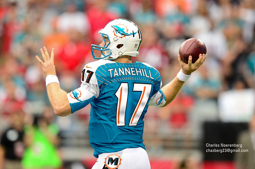
All entries are listed here: http://www.flickr.com/photos/65516705@N00/sets/72157632946594071/detail/
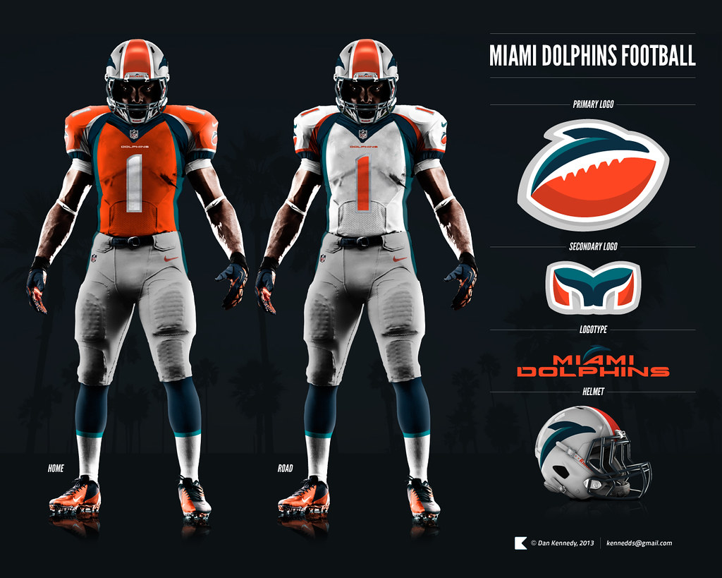
 Fin Dforum_veteran
"CANEPHINS wrote:
This one is actually not bad at all.
I love this.
Love.
I wish this is what we'd do.
CANEPHINSforum_veteranI like the secondary logo, but the logo on the helmet is bad.
The uniform itself is pretty sweet. I like how the lines are up to date but also form an M.
Grey pants is always a +1 in my book.
 Dol-Fan Dupreeforum_veteran
I like the one with the Dolphin into a D. I think it looks really cool.
Holland is a huge upgrade over McCain
I want to be alive, I am alive! Alive, I tell you! Mother, I love you, those are no longer just words. I want to hold you, I want to run in a stream, I want to taste ice cream but not just put it in my mouth and let it slide down my throat but really eat it. - Robot Morty
 JimTossforum_veteran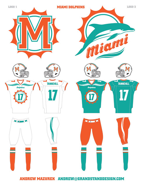
I LOVE this logo.
Not so big on the sunburst letters but the rest is nice.
 Alex13subscriber
"JimToss wrote:
I LOVE this logo.
Not so big on the sunburst letters but the rest is nice.
oh my god the jersey´s look awful
 PHINfromAFARNew Member
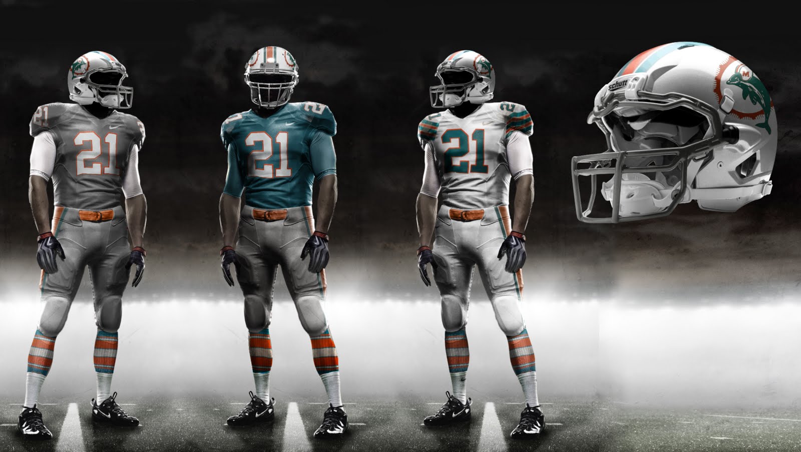
These are the best mocks I've seen to date as far as colour scheme. Honestly though, if we are going to make a change, lets not do it half assed and just make minor tweaks. I would love to see Primary as grey with aqua, orange and white trim. Baring that maybe something even more radical as long as its clean and professional looking. Some of the Mocks floating around look like low level arena league designs.


 djphinfansubscriber
"PHINfromAFAR wrote:
These are the best mocks I've seen to date as far as colour scheme. Honestly though, if we are going to make a change, lets not do it half assed and just make minor tweaks. I would love to see Primary as grey with aqua, orange and white trim. Baring that maybe something even more radical as long as its clean and professional looking. Some of the Mocks floating around look like low level arena league designs.
It's always been the best..people were bitching about the grey.boo hoo..it's bad ass and would be great..

 Tone_Esubscriber
The secondary logo is the same as the ex-NHL Franchise the Hartford Whalers. No thank you.
 Tin Indianforum_veteran
Shoot me. just shoot me........
Not My Circus, Not My Monkeys.
 Coral ReeferNew Member
"Tin Indian wrote:
Shoot me. just shoot me........
:lol:
Agreed.
Honestly out of every single redesign concept of our logo I have seen (and there are hundreds at this point) NONE come close to the concept we now have.
Just proof to me how well the original team that designed the Dolphins identity did.
Shame this old codger owner of ours is determined to F it up just to try and shake things up.
RIP Jetssuck
Coral ReeferNew Member"djphinfan wrote:
It's always been the best..people were bitching about the grey.boo hoo..it's bad ass and would be great..
Grey sucks.... It's a depressing color associated most with overcast skies and rainy days.
Nothing says S. Florida more than that????
RIP Jetssuck


 unifiedtheoryluxury_box
"CANEPHINS wrote:
This one is actually not bad at all.
IMO...it's ****ing awful.
The uniforms look like they will be dated in a week and the secondary logo is a DIRECT rip off of the old Hartford Whalers.
On the bright side, I'd save a lot of money on merchandise because I would not buy a single thing.

I'm on Twitter @ut_pez
unifiedtheoryluxury_box"Hurricane wrote:
I loved the Whalers, so it's not an issue for me.
For me, it's the fact that our PRIMARY logo is just a ******* football.
The Whalers had one of the best logos/uniform combos in NHL history (the old green ones, not the blue they used at the end).
I'm on Twitter @ut_pez
 inFINSibleforum_veteran
http://www.flickr.com/photos/65516705@N00/8540280908/
I like this one...


 MAFishFanforum_veteran
"305 wrote:
bwahaha Dolphy
it's like our own fans hate us
on Twitter @mpark14news
 DearbornDolfanNew Member
http://www.flickr.com/photos/65516705@N00/8539113683/in/set-72157632946594071 <--- Not a fan of the colors, but the actual design of the uniforms was top notch
http://www.flickr.com/photos/65516705@N00/8540217330/in/set-72157632946594071 <--- Keeps the colors and is another set that is very Nike
 Clark Kentforum_veteran
"CANEPHINS wrote:
This one is actually not bad at all.
One of the better mock ups out there. Like the M in the uniform design.
Two things I would change...
1. Get rid of the navy blue. It's out of place.
2. The helmet and logo look like trash. I think we all know the mock up with the mean dolphin? Put that mother ****er on this uniform, and we're looking good.
Dol-Fan Dupreeforum_veteranhttp://www.flickr.com/photos/65516705@N00/8539109725/ -> these ones are OK
http://www.flickr.com/photos/65516705@N00/8539124587/ -> I also really like these ones. With the Dolphin jumping around the sun.
http://www.flickr.com/photos/65516705@N00/8540230690/
http://www.flickr.com/photos/65516705@N00/8539164919/ -> These ones are my favorite. I like the Dolphin turning into a D. I really like how the shoulders are a sun burst with a number.
Holland is a huge upgrade over McCain
I want to be alive, I am alive! Alive, I tell you! Mother, I love you, those are no longer just words. I want to hold you, I want to run in a stream, I want to taste ice cream but not just put it in my mouth and let it slide down my throat but really eat it. - Robot Morty
 fragsNew Member
I really liked #4 the "D" logo; new angle on things.
Dare I say that I was always a fan of the Finheaven type "mean" dolphin.
"djphinfan wrote:
It's always been the best..people were bitching about the grey.boo hoo..it's bad ass and would be great..
I agree. I understand the south florida color scheme but we are Dolphins they are grey. Get with it, agree they're bad ass.
Dol-Fan Dupreeforum_veteran"siciliansith wrote:
I agree. I understand the south florida color scheme but we are Dolphins they are grey. Get with it, agree they're bad ass.
The problem I have with Grey is that grey is so common. The Seahawks new alternate uniforms are grey.
That is what i liked about the orange uniforms. They might not be the prettiest color, however they were at least different.
Holland is a huge upgrade over McCain
I want to be alive, I am alive! Alive, I tell you! Mother, I love you, those are no longer just words. I want to hold you, I want to run in a stream, I want to taste ice cream but not just put it in my mouth and let it slide down my throat but really eat it. - Robot Morty