Miami Dolphins New logo/uniforms Thread
7797 replies
 Mrtreeforum_veteran
Update on new logo
"Section126 wrote:
Quick question to all...who do you think has the best logo in the NFL?
Raiders hands down
 dWreckNew Member
"Finascious D wrote:
Something for everyone.
Old colors and dolphin.
No helmet
No cartoony face
An "M" for Miami
Fits correctly on a hat and other merchandise

I like this one. But - I think the white dolphin should be silhouetted as opposed to on the front, I think it looks bad to cover little bits of the "M". The "M" should be prominent and whole in my opinion.
my 2 cents on this one in particular - Make the dolphin maybe a different color or shade, and make the "M" the overlapping layer, but the whole dolphin still visible, transparent or something. Don't cover any of the letter. and although I like the idea of this and the letter based logos, I am not a fan of the font the M is in. too plain and straight.
Definitely an idea that can be touched up and worked on

The KRAKEN! Still proving doubters wrong on the weekly.
Get well soon Tanny. #ThatsMyQB
 rafaelforum_veteran
"Rocky Raccoon wrote:
People call this prototype boring as hell, yet the Cowboys classic, obscenely popular logo is a damn star.
I like classic. I always hated how our old logo looked so cartoony. The helmet made me think of it as a saturday morning cartoon character. (for the younger set, cartoons used to only be on Saturday morning).

rafaelforum_veteran"dcafiero wrote:
I like this one. But - I think the white dolphin should be silhouetted as opposed to on the front, I think it looks bad to cover little bits of the "M". The "M" should be prominent and whole in my opinion.
my 2 cents on this one in particular - Make the dolphin maybe a different color or shade, and make the "M" the overlapping layer, but the whole dolphin still visible, transparent or something. Don't cover any of the letter. and although I like the idea of this and the letter based logos, I am not a fan of the font the M is in. too plain and straight.
Definitely an idea that can be touched up and worked on
I like this better than our current logo, but I still can't say "I love it". I agree that the font is wrong. I don't tend to like letters in logos, but maybe if the "M" was there but de-emphasized somehow.?
 HardKoreXXXNew Member
Falcons, Bengals, Buccs, Lions (new) and Chargers all have solid logos. And of course I've always been partial to the Dolphins logo. Until recently, NFL logos were part of what I did for a living. (engraving them, not design). If you're talking worst logos, that's tough, because several teams have had pretty plain/generic ones for years. Teams like the Cowboys, Colts, Packers and 49ers have pretty boring ones. I've never been a fan of the Jags or Panthers logos either.
"Making people on the Internet feel better about their own lives since 2004"
 WhiteIbanezNew Member
"rafael wrote:
A huge factor in that is simply that it's what they're used to. It's human nature. Most people prefer what they're used to. To pretend that it isn't the case in this one instant is disingenuous.
That's not it at all at least for me. I want a logo change. I think it is long overdue.
The problem is that leaked logo sucks ass. It belongs on the side of a cruise ship.
Wimpy as hell.
dWreckNew Member"rafael wrote:
I like this better than our current logo, but I still can't say "I love it". I agree that the font is wrong. I don't tend to like letters in logos, but maybe if the "M" was there but de-emphasized somehow.?
De-emphasizing the 'M' would be good for the style of logo, but i think a lot of it really has to do with the font. If someone took their time with this idea and ran with it I think it could be good.
If its a letter based logo, you don't want to cover any parts of the M, and the font makes it that much worse. Make the dolphin transparent (or something along those lines where it still shows) and Get the letter on the front layer, while not letting 'M' overpower the whole logo at the same time, and I think you got a winning concept.
The KRAKEN! Still proving doubters wrong on the weekly.
Get well soon Tanny. #ThatsMyQB
 GISHforum_veteran
"Firesole wrote:
^^HATE HATE HATE this logo
LOVE LOVE LOVE this one:
Sent from my iPad using Tapatalk


That one is f-ing sweet. It's actually mean looking
rafaelforum_veteran"dcafiero wrote:
De-emphasizing the 'M' would be good for the style of logo, but i think a lot of it really has to do with the font. If someone took their time with this idea and ran with it I think it could be good.
If its a letter based logo, you don't want to cover any parts of the M, and the font makes it that much worse. Make the dolphin transparent (or something along those lines where it still shows) and Get the letter on the front layer, while not letting 'M' overpower the whole logo at the same time, and I think you got a winning concept.
I really can't picture what you're saying. I understand the words, I just can't form them into a logo I can visualize.
 Perfectville_USANew Member
I like it myself, what it could look like on a helmit.

 PhinsRDbestforum_veteran
"GISH wrote:
That one is f-ing sweet. It's actually mean looking
To me it also looks like a step up from the current one. The "prototype" looks like a down grade.
 Clark Kentforum_veteran
"Section126 wrote:
Quick question to all...who do you think has the best logo in the NFL?
Tampa Bay. The logo, uniforms, pirate theme, is awesome. From worst to best with their last logo/uniform change.
 MrCleansubscriber
"Section126 wrote:
Quick question to all...who do you think has the best logo in the NFL?
Since they have been in the league, up til now, Miami does. Not sure we will after the logo change.
“... I hope I never ridicule what is wise or good. Follies and nonsense, whims and inconsistencies do divert me, I own, and I laugh at them whenever I can.”
― Jane Austen, Pride and Prejudice
MrCleansubscriber"PSG wrote:
Redskins
Rams
Other than changing the color of the horns, the Rams logo is the oldest in the league.
“... I hope I never ridicule what is wise or good. Follies and nonsense, whims and inconsistencies do divert me, I own, and I laugh at them whenever I can.”
― Jane Austen, Pride and Prejudice
 Rocky Raccoonmoderator
Yeah I didn't include us in the discussion for best logo because it would be bias.
 FishweiserNew Member
Quick question to all...who do you think has the best logo in the NFL?
Ive always liked Chicago and Green Bays. That Chicago "C" and Green Bays "G" are to the NFL what the statue of liberty and empire state building are to America. When you think of "NFL" Football, those are among the first few helmets you think of.
dWreckNew Member"rafael wrote:
I really can't picture what you're saying. I understand the words, I just can't form them into a logo I can visualize.
If I had any artistic ability whatsoever I'd probably do one myself, but those times have passed. I can't really visualize it either, but I also understand my words lol.
Maybe someone who has any art skills on Pc can work something up with this one? it'd be cool to see a solid miami letter based logo. heres what i'd try to add a little more simplified.
1. The font on the M overpowers the logo, heavily. It needs to be less prominent and emphasized, possibly more 'curvy'. To be honest almost any font would be better than that one. lol
2. The middle drop in the "M" is covered by the dolphin silhouette, as well as the left indent, although they aren't HUGE parts of it, if you are going to have a "letter" based logo, you don't want to cover any of it. I was proposing something along the lines of making the dolphin transparent or something, that way the 'M' shows in its entirety, whilst still have good ol flipper there.
3. as far as the 'M' not overpowering the logo, thats where getting a better font comes in that fits the picture best and getting it onto layer 1 as opposed to layer 2, how it is in this picture.
The KRAKEN! Still proving doubters wrong on the weekly.
Get well soon Tanny. #ThatsMyQB
MrCleansubscriber"Aqua4Ever04 wrote:
I don't like it. Letter logos are for baseball. Every football team should have an actual logo.
Green Bay and Chicago do not agree with you.
“... I hope I never ridicule what is wise or good. Follies and nonsense, whims and inconsistencies do divert me, I own, and I laugh at them whenever I can.”
― Jane Austen, Pride and Prejudice
 Paul 13moderator
"Section126 wrote:
Quick question to all...who do you think has the best logo in the NFL?
Best logo or best helmet? Two different questions.
Twitter @Silver_Hornet (follow me and I'll follow you, just let me know who you are on here!
MrCleansubscriber"Aquafin wrote:
GUYS I Love the logo as is but its time to have a second color helmet and my reason is that when the seahawks changed unis they have a renewed images and its helping them.
Yeah, having better players has nothing to do with it.
“... I hope I never ridicule what is wise or good. Follies and nonsense, whims and inconsistencies do divert me, I own, and I laugh at them whenever I can.”
― Jane Austen, Pride and Prejudice
Paul 13moderatorLogos:
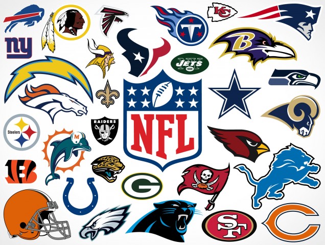
Helmets (Buffalo's isn't accurate, but I didn't think anyone would vote for them anyway :shifty:):

Twitter @Silver_Hornet (follow me and I'll follow you, just let me know who you are on here!
MrCleansubscriber"Dolphins1Beatles wrote:
Here is the prototype of the logo thanks to DolfansNYC: http://www.dolfansnyc.com/2012/12/23/is-this-the-new-miami-dolphins-logo/
I really like the Dolphin, but think it looks more like an alternate logo. They actually should've kept the current one and made this the alternate without the sun. But...this is just the prototype, there could have been changes made to it. Instead of a jumping Dolphin in front of the sun, its a swimming Dolphin...I guess its no big deal. I like our current logo better than this prototype though, hope they make the final one it a bit better. I wonder if they should center the sun more.
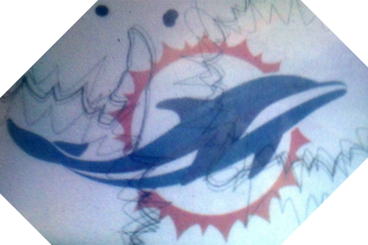
That dolphin looks like a frolicking, playful dolphin.
“... I hope I never ridicule what is wise or good. Follies and nonsense, whims and inconsistencies do divert me, I own, and I laugh at them whenever I can.”
― Jane Austen, Pride and Prejudice
MrCleansubscriber"Firesole wrote:
^^HATE HATE HATE this logo
LOVE LOVE LOVE this one:
Sent from my iPad using Tapatalk
Even me, the oldest of the old school supporters, could live with this one.
“... I hope I never ridicule what is wise or good. Follies and nonsense, whims and inconsistencies do divert me, I own, and I laugh at them whenever I can.”
― Jane Austen, Pride and Prejudice
 SICKforum_veteran
The panthers updated logo is pretty sweet. Love their colors too.
Co-Host of the Welcome to Perfectville Podcast

Log in to reply.